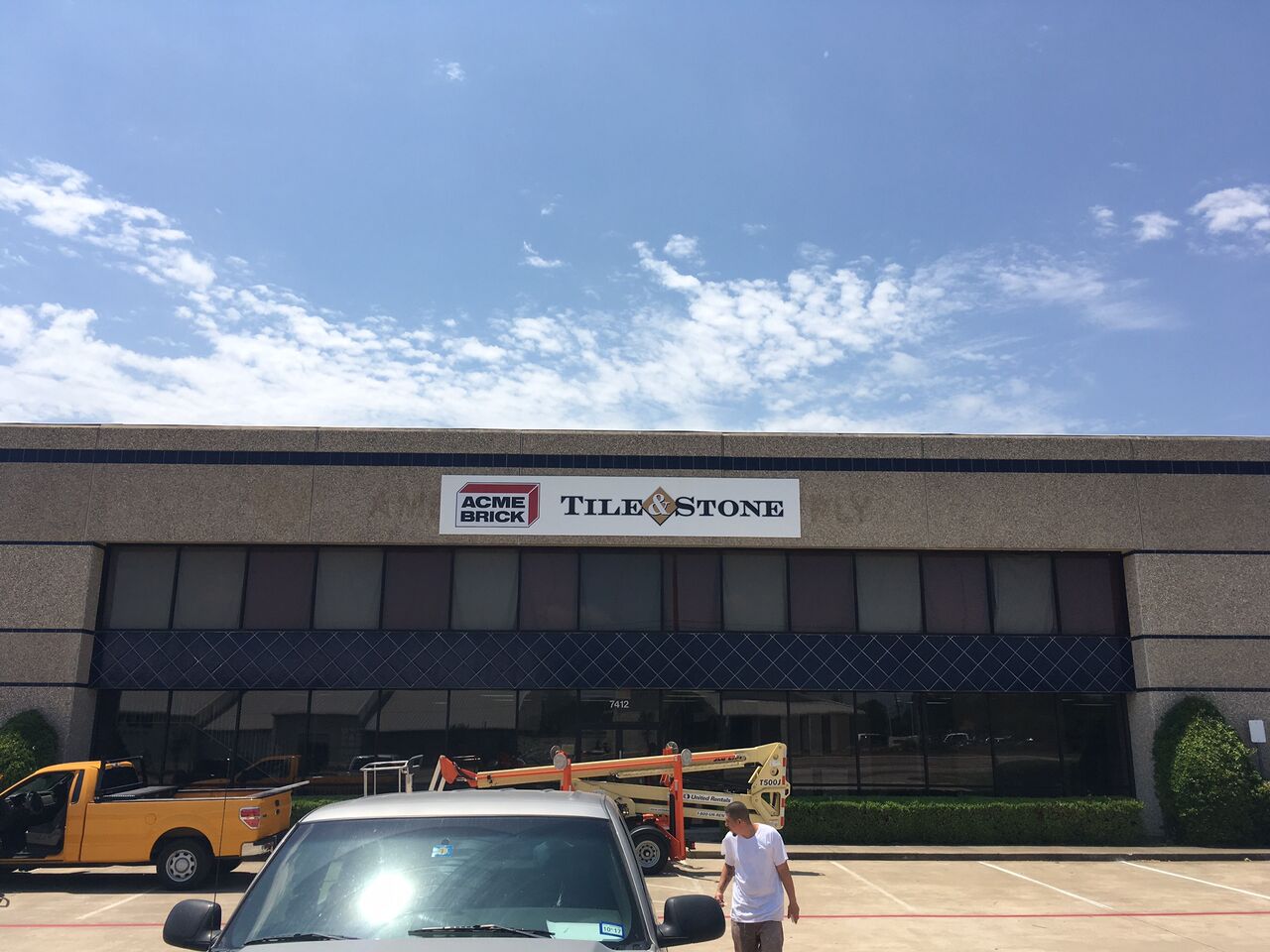
The founding of Acme Brick dates back to 1891. Since that time, the company has undergone plenty of changes. What has not changed, however, is the appeal of its high-quality products and commitment to customer service. Just recently, the business’ management team decided to rebrand, which will help the company to retain its relevance in a contemporary market. (Take a few minutes to read up on the amazing story of this business. Its brand success if perhaps second to none.)
Rebranding with a Pan Sign
After we consulted with our client, we designed a sizeable non-illuminated pan sign. It features the famous Acme Brick name and logo alongside the Tile & Stone designation of the storefront. We removed the outdated signage elements to make room for the pan sign. By selecting a white color for the backdrop, the red of the brick logo and the dark color of the lettering stand out. A visual respite comes in the form of the gold color for the tile and stone part of the marker. This sign is easy to see and perfectly encapsulates the company’s brand message.
What is a Pan Sign?
We do not talk enough about pan signs. Between the lit and unlit channel letters, these signage elements do not get a lot of demand. But for the business client who selects one of them, it allows for an excellent setup.
- Single or double-sided displays. Pan signs are frequently part of lightbox cabinets. When mounted to poles, they address consumers coming from multiple directions. For this reason, we typically manufacture two facings for these setups.
- Lit or unlit. The majority of lightbox cabinets, just like channel letters, allow for the installation of LEDs. Our technicians choose a translucent acrylic or polycarbonate material. When the light turns on after dark, it bolds the color displays. But some clients do not need the illumination and opt for an unlit pan sign instead.
- Customizable. We cut the pan sign to size. Whether it becomes part of a cabinet or displays with a frame, we ensure that you get the right size for your needs. We can also help you with the creation of a unique shape rather than the standard rectangular form.
Making Your Corporate Persona Stand Out
The real differentiation takes place in the way that we finish the manufacturing of the product. Typically, you might choose a flat facing. Doing so allows us to apply printed acrylic sheets that feature your corporate information. If you use gradient color changes in the display of your name or logo, consider this the best option.
However, if you want to take advantage of a three-dimensional effect, why not opt for a pan-faced design that adds at least an inch or more to the sign’s depth? It stands out from its frame, which creates a visually appealing display. Do not stop there. With the option of embossing the material, we can make your logo or lettering stand out. We do so by treating the material from the underside. For a more intricate look, consider debossing the sign in addition to embossing it. This combination allows for the presentation of multiple textures, raised features, and recessed elements.
How to Order a Pan Sign
If we have piqued your interest in adding a pan sign to your outdoor (or indoor) signage setup, discuss your thoughts with our experts. Our graphic artists help you to envision the good looks of the marker before you commit to the final product. Play around with the embossing option for excellent results. If you are rebranding or refurbishing a sign that uses pan face technology, we can help you put a contemporary spin on the look.
Call us today to get started on this project!
{{cta(‘2b42f406-2e15-408f-b2ff-3557c5017156′,’justifycenter’)}}


